


Interested in our services
Contact our experts to provide further information


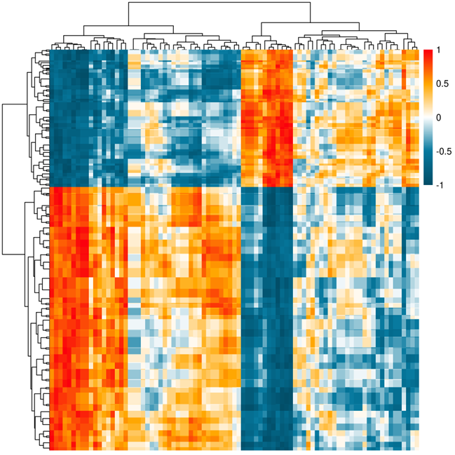
The heatmap of correlation coefficient. Heatmap based on correlation coefficient. In this figure, each row represents a differentially expressed protein, while each column represents a differentially expressed metabolite. The darker the color is, the higher the correlation coefficient is.
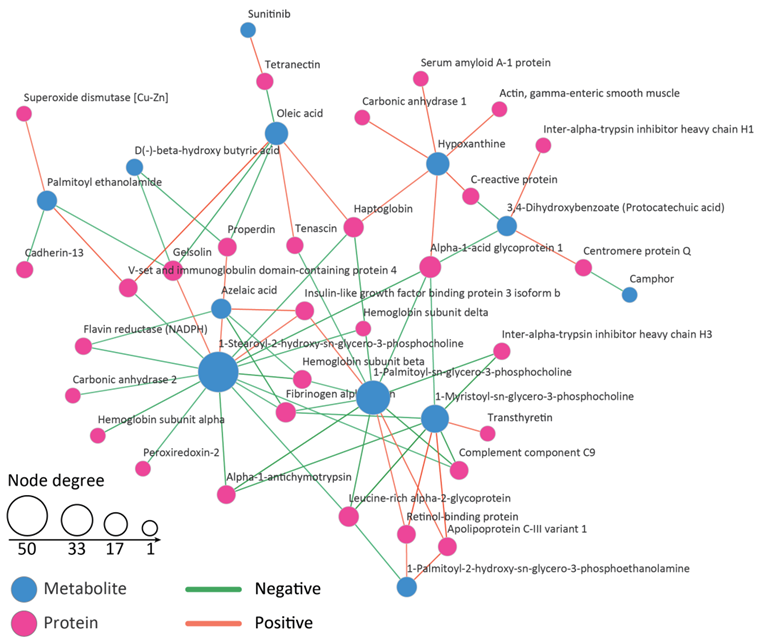
The network of correlation coefficient between proteins and metabolites. Network displays the correlations with correlation coefficient higher than a threshold. In the network, blue node represents metabolite and red represents protein. Green edge represents negative correlation coefficient and orange edge represents positive correlation coefficient. The size of the node represents the degree of each node.
Proteomics integrated with metabolomics: analysis of the internal causes of nutrient changes in alfalfa at different growth stages-2018-BMC Plant Biology
Interested in our services
Contact our experts to provide further information